
At TalkBox, “good design” = emails that land, load, and get clicked. We’re all about clean call-to-action and layouts that render consistently across Gmail, Outlook, and Apple Mail to protect deliverability and engagement. Read our top 5 email design tips for inbox performance (and not just aesthetics)
- Brand Front and Centre
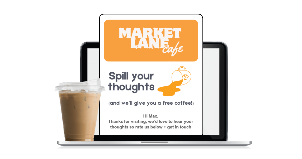
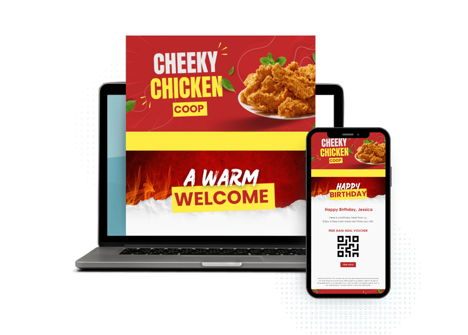
Brand recognition is key. In TalkBox, use the Sections block to place your logo above the fold so subscribers instantly know who the email is from. It builds trust fast and sets the tone before they even start scrolling.
2. Turn Snoozes into Sign Ups
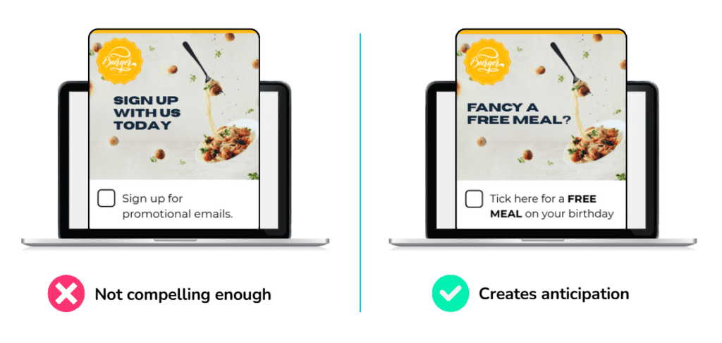
Think like your customer – would you rather click “Sign up for emails” or “Receive a FREE birthday meal”? The first is boring and might hit spam, the second is all about them. Make your banners pop with the right offer for the best opt-in.
3. Mobile-first (not just mobile-friendly) View In Mind
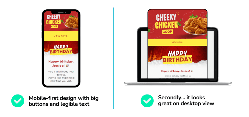
Most emails are opened on mobile, and inboxes now penalise clunky layout. Solution? Design for thumbs first. Buttons set to medium or large in TalkBox editor (easy to press for fat fingers), short paragraphs, text size (ideally 14px-16px) and use single column layout.
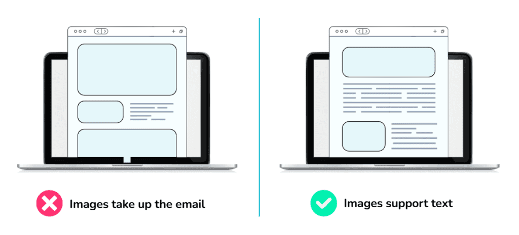
4. Don’t Let Your Emails Load Like a Sloth
Design emails with a healthy mix of images and text. Image-only emails can fall flat when images don’t load. Keep things lightweight by optimising images – sitting at 650px wide is a handy rule of thumb.
Adding clear alt text helps your message still land, even if visuals are blocked. Faster-loading emails get more love, so read more on keeping emails fuss-free.
5. Hook Them Before The Scroll
Users decide whether to read in seconds. So what shows up before they even scroll down determines if they want to stay for the rest. Prioritise content hierarchy and place the most important message, CTA, or offer at the top.