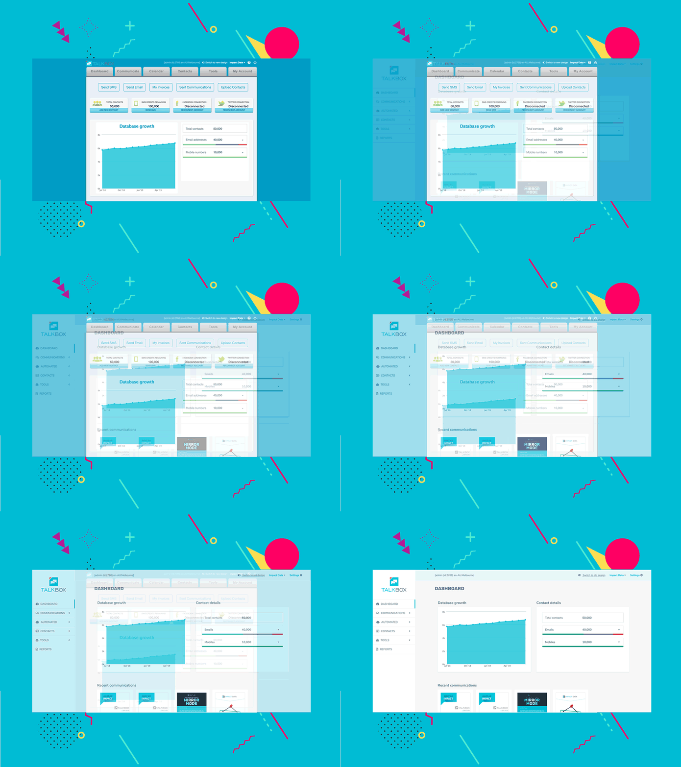
TalkBox has had a refresh, focusing on a clean and modern look. It’s designed to be easier to navigate, as well as utilise the whole screen.
To use the new look app, click on the ‘Switch to new design’ link at the top of the screen.

The old design will eventually be phased out but for the time being, you can switch back and forth between the old and new designs.
We’ve also relocated a few features and simplified others to make it easier for you to send great communications.
Some of the more obvious changes include:
- The main navigation is on the left-hand side, rather than at the top
- Your account settings are now located under Settings in the top right
- Automated communications now have their own section called Automated in the left-hand navigation (previously located under Communicate).
- The calendar is now located under Tools (previously located in the main navigation)
- There is now a Reports navigation button, replacing the old Sent communications
Less obvious changes include:
- Segments are now called Filters. You can still find them under Contacts.
- Flyers are now called Promotions. If you send an SMS communication that links to a voucher and/or other new content, that content is known as a promotion.
We are continuing to improve TalkBox, so keep a look out for further updates. If you have any feedback regarding the new design or run into any problems, please let us know by emailing support@impactdata.com.au.


